Correcting the record: Sophomore gets the EPA to change its map

In Associate Professor Robert Holahan’s Introduction to Environmental Policy class, students noticed something missing: the entire state of Hawaii.
The class was studying the passage of the Clean Air Act and the laws that deal with air pollution. It was early February — weeks before the escalation of the coronavirus pandemic — and class still met on campus.
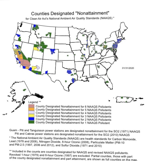
Students considered a map showing counties around the nation that weren’t in compliance with the National Ambient Air Quality Standards (NAAQS) for pollution control. The 48 states of the North American mainland were there, along with Alaska and the U.S. territories of Guam and Puerto Rico. Hawaii was absent, likely because all of its counties met the standards.
That didn’t sit well with Kellyanne Allen, a sophomore majoring in biochemistry and environmental studies. After class, she used the “Contact Us” feature on the federal Environmental Protection Agency’s website. Her questions were direct: Why wasn’t Hawaii represented on the NAAQs map? Would the EPA consider adding a footnote mentioning the state’s compliance?
The EPA responded within an hour, affirming that Hawaii was compliant with all standards and agreeing to consider adding a footnote about the state’s status. When Allen revisited the map at the end of March, she was pleased to see that Hawaii had been added.
“Having the state pictured provides a better representation of the data, since it’s important to acknowledge both the areas in compliance and those that are not. Instead of just showing the ‘bad,’ we also need to celebrate the victories of environmental regulation,” she said.
A native of West Winfield, N.Y., a small town near Utica, Allen plans to pursue environmental planning or policy in her future career. The experience in Holahan’s class taught her the importance of asking questions and reaching out to correct the record, she said.
“It took me five minutes to send that email, and the change was made as a result of my small action,” she said.
Holahan, an associate professor of both environmental studies and political science, noted that this exchange was a good example of “map justice.” How you display data in maps matters, from the over-projection of the Northern Hemisphere that makes Greenland look larger than South America, to the omission of Staten Island from many New York City maps.
“The federal government is often seen as something far off and separate from ourselves, but really it’s simply a network of individual people who, as people, often recognize a good point for what it is,” he reflected. “Unless you point out what’s wrong or missing, though, you can’t expect anything to change.”


