
Books as art: A conversation with Blažo Kovačević

The Binghamton University Art Museum and Associate Professor of Art and Design Blažo Kovačević won an honorable mention in the American Alliance of Museums’ 29th annual Museum Publications Design Competition for his 2019 exhibition catalog, Seymour Chwast: Works of War. It’s the first time the Art Museum has entered the competition, which draws museums from across the United States. Kovačević is also the museum’s art director.
The museum has been a part of the AAM since 2012, and Kovačević has designed multiple catalogs through the years: hard-bound art books featuring pieces from the exhibition, essays and sometimes interviews with artists.
His designs are striking and visually playful: a cover that mimics a photograph, complete with the artist’s signature and hand-written instructions on the back, to capture the essence of Barbara Morgan’s process as a photographer; a word search puzzle on a textured cover for a catalog for Milton Glaser, of “I ♥ NY” fame.
“They’re really a work of art themselves,” said Art Museum director Diane Butler. “It’s not a record of an exhibition with a typical glossy cover. It captures the essence of the artist’s work differently than the exhibition on the wall.”
In the following interview, Kovačević discuss the process that goes into making an award-winning catalog.
It’s a digital world. Why do you still publish print exhibition catalogs today?
In 2015, when I joined the team at the Binghamton University Art Museum, I opened this conversation with Diane Butler, director of the museum. We realized that we shared a similar vision, that the exhibition catalog is not just an expensive leftover following an exhibition. Rather, it is a creative tool for promoting, supporting and archiving exhibitions.
Despite today’s best efforts to replace experiences with digital representation, there is still something magical when you hold a beautifully made catalog in your hands. You can appreciate and cherish this object that encompasses all the aspects of the process: how much care went into fundraising, planning, collaborating and finally putting all ingredients together in a package that has carefully considered size/value factors. You can easily share a catalog with others. It is something that you will proudly keep on your library shelf or coffee table and occasionally pick up again and revisit with new vigor and fresh interest.
It will never be buried or even lost in the digital conundrum of apps and formats, memory losses, archival fears and similar concerns. In the digital world, fear rules. In the analog world, which is well occupied by the exhibition catalog, excitement and perpetual access to fresh art is always within your reach. There are many challenges in publishing. It is very expensive and labor intensive, but the many unique rewards more than compensate for the effort.
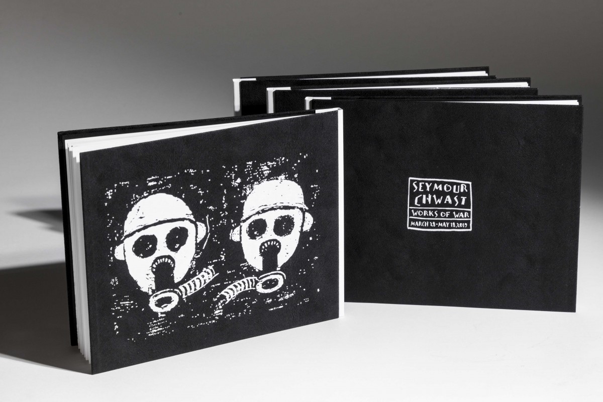
Congratulations on your award from the American Alliance of Museums for your catalog of Seymour Chwast’s works. As an artist, what does this recognition mean for you?
This award came as a surprise! I am very humbled to be noticed in such a strong competition where mighty world museums with multi-million-dollar budgets are competing with small but ambitious ones such as ours. For example, last year an honorable mention was received by the Metropolitan Museum. … Diane’s vision for the museum is making strides and it feels good to find the Binghamton University Art Museum in the company of the Met, the National Gallery of Victoria, Australia, the Getty, and the Virginia Museum of Fine Arts, for example. Few people can see and appreciate how much expertise, care and enthusiasm goes into the museum’s projects with just a small team of dedicated professionals. This award is also recognition of this team and its contribution to the success of each exhibition.
How do you prepare for a project such as this, in which you’re looking to capture the scope of an exhibit?
I have a collaborative approach in designing exhibition catalogs for artists and designers. There is an established rule that designers should not interfere with the art in publications that accompany art exhibitions. The designer is supposed to be objective and allow for the artwork to dominate the process. I take this a step further: I strive to create another, parallel platform for the art to speak alongside the actual exhibition.
In an effort to celebrate the artwork in the best possible way, I believe there is room for the creativity of the catalog designer to interpret certain aspects of the artwork, the artist’s life and even the impact it has had and continues to have. You can always draw an interesting connection between these aspects. Sometimes you are lucky to discover it, but sometimes it escapes you.
Being an educator helps in this process, as I am constantly analyzing and evaluating works of art. This gives me an interesting perspective in what can be done and what connections can arise from the work itself. Added to this, you have other elements of the catalog project, such as an essay or an interview conducted with the artist. These also play interesting roles in the success of the catalog.
As an artist myself, I can have insight into the making of the artwork. Ultimately, it all emanates from the quality of the artwork, its concept, the mastery of the execution, the deeper significance and so on. For me personally, an exhibition catalog has to be an exhibition on its own, in a small but highly potent package. It has to communicate the important aspects of the artwork, the exhibition, the curatorial vision and even aura of the space itself within its covers, to survive long after the exhibition has ended.
Finally, I see the catalog as an art form (sometimes even an art piece) on its own, a testament to the time and conditions that it aims to capture. I curated and designed the installation of Seymour’s exhibition. For me, the design of the catalog was a natural extension of that vision.
Were there any particular challenges in the catalog on Seymour Chwast? Or any design elements you would like to draw attention to?
Ha! Of course there were challenges. Starting with certain technical issues, followed by paper choices and the reproduction challenges that are almost always present in the creative decision-making. All of these had to be carefully addressed. Seymour’s artwork is powerful and expressive, with strong visual elements and vivid colors. These are difficult to manage and reproduce in the offset printing process. These and other elements are all a natural part of a process that is complex and risky from the start to the end. The risk-taking aspect of the whole process is something that I embrace and love.
You use such fascinating elements in your catalogs. How do you come up with these sorts of ideas? Do they emerge from engagement with the artist’s work?
They emerge from my thorough research on the artist and her/his oeuvre, and also talking to them when possible, as I search for tiny hints of direction. This was certainly the case with the catalog for Barbara Morgan’s exhibition, The Inner Landscape of Dance: Photographs by Barbara Morgan 1935–1944.
For this catalog, as was the case with many others we produced here in the museum, I worked with a special commercial print shop called Publikum in Belgrade, Serbia. I have been working with them for years on almost all my publications, whether they are produced for the museum or not. .… Publikum, under its late director Bata Ristanović, is one of those revered businesses that appreciate what we do, and they do their part in celebrating the artist through the vision of the designer.
For the Barbara Morgan catalog, I thought it would be nice to produce a catalog that is also a framed photograph, so in a sense you can treasure and display a photo done by the artist together with the catalog, all in one. For this concept to work, I devised an approach that combines two book covers in one catalog. Years ago, the late artist had left instructions on one of her photographs (for example, where to crop the photograph) for the designer (of an earlier publication). I thought that it was important not just to know and follow that, but to follow her intention even more so, and show her process and way of thinking. By following those instructions, I designed the outer cover as Passe-partout, a kind of pasteboard to serve as a frame through which you can see the true cover: one of the famed photographs done by the photographer.
Similarly, for the catalog for the exhibition Milton Glaser: Modulated Patterns, I looked at his logo and realized how it could be incorporated into a playful word search puzzle. I always thought that Milton Glaser’s impact on the design world (and everything else really) is always present, but not acknowledged enough. As the curator of his exhibition, I wanted to show that side and emphasize the history of graphic design through the body of his work. There are many subtle homages to Glaser in my catalog, from the word search puzzle, to the tactile quality of the cover and the art paper used for the pages, to the borders and ruled pages. We were very fortunate and honored to be able to host his exhibition while Milton was still alive. He gave us so much inspiration, energy and words of wisdom that were captured in the interview conducted by Associate Professor of Art History Tom McDonough. Milton told us that he was thrilled with the exhibition and the catalog, and has included it into his professional archive. Since Milton has subsequently passed away, my catalog remains another, albeit modest, space in which people can connect and explore Milton’s work.
Are there any artists or exhibitions you would really like to do a catalog for?
I love designing catalogs for my wife, painter and professor Natalija Mijatovic. Living with her work around me, I have a deep understanding and appreciation for it. Also, I think I am biased — and this is a good thing. This is the most challenging type of engagement. I made several catalogs of her work already and I am always eager to impress her, which is really hard.
I was looking forward to curating and producing the catalog for a renowned Spanish designer, Isidro Ferrer. Due to COVID-19, the museum had to postpone the exhibition, but we remain hopeful that we will be able to go back to this project in the fall of 2022. Many interesting aspects are planned for this event, from hosting the artist’s visit and producing an artwork in-situ with our students’ assistance, to curating the exhibition and designing the catalog.
I also designed catalogs for my own exhibitions, and I confess that I am the most difficult artist to work with!